
本文的目标读者
Golang本文摘要
主要介绍 Go 中用以绘图的开源库,分别是:
GitHub - wcharczuk/go-chart: go chart is a basic charting library in go.
https://github.com/wcharczuk/go-chartGitHub - vicanso/go-charts: A charts library for Golang
https://github.com/vicanso/go-chartsGitHub - vdobler/chart: Provide basic charts in go
https://github.com/vdobler/chartGitHub - gonum/plot: A repository for plotting and visualizing data
https://github.com/gonum/plotGitHub - go-echarts/go-echarts: 🎨 The adorable charts library for Golang
https://github.com/go-echarts/go-echarts
我的需求是生成一个时间轴类型折线图的图片插入到我的报告中,前面两个库与我的需求比较符合,所以我会着重介绍;后面三个库不满足我的需求,在本文会大略带过。如果懒得看正文,这是我总结的表格:
| go-chart | go-charts | chart | plot | go-echarts | |
|---|---|---|---|---|---|
| 使用文档/示例完善 | ✅ | ✅ | ✅ | ✅ | ✅ |
| 学习成本 | 中 | 低 | 高 | 低 | 低 |
| 支持的图表种类 | 少 | 少 | 少 | 中 | 多 |
| 支持时间轴 | ✅ | ✅ | ✅ | ❌ | ✅ |
| 支持输出图片 | ✅ | ✅ | ✅ | ✅ | ❌ |
| 支持设置标签 | ✅ | ✅ | ✅ | ✅ | ✅ |
| 支持折线图 | ✅ | ✅ | ❌ | ✅ | ✅ |
| 支持自定义图表 | ❌ | ❌ | ❌ | ✅ | ❌ |
| UI美观 | ⭐️⭐️⭐️ | ⭐️⭐️⭐️⭐️ | ⭐️⭐️ | ⭐️⭐️ | ⭐️⭐️⭐️⭐️⭐️ |
还有一些库,例如
gg
https://github.com/fogleman/gg
Goimage/drawgo-chart
go-chartGolanggo-chart官方效果图
-
曲线图

-
单轴折线图
-
双轴折线图
-
饼状图
-
柱状图

安装
go get -u github.com/wcharczuk/go-chart
实际使用
influxdb/*
前面省略查询 influxdb 过程
*/
xValue := []string{}
yValue := []float64{}
// 处理查询到的结果数据
for _, value := range allRequest[0].Series[0].Values {
if value[1] == nil {
yValue = append(yValue, 0)
t := value[0].(string)
xValue = append(xValue, t)
} else {
fmt.Println("value:", value[1])
x, _ := value[1].(json.Number)
s, _ := x.Float64()
yValue = append(yValue, s)
fmt.Println(reflect.TypeOf(value[0]))
t := value[0].(string)
xValue = append(xValue, t)
}
}
// 时间轴的显示格式
format := chart.TimeValueFormatterWithFormat("15:04")
lenX := len(xValue)
// X轴内容 xValues 及 X轴坐标 ticks
var xValues []time.Time
var ticks []chart.Tick
for i := 0; i < lenX; i++ {
t, _ := time.Parse(
time.RFC3339,
xValue[i])
x := t.Local()
xValues = append(xValues, x)
ticks = append(ticks, chart.Tick{Value: getNsec(t), Label: format(t)})
}
// 定义曲线
var series []chart.Series
series = append(series, chart.TimeSeries{
XValues: xValues,
YValues: yValue,
Style: chart.Style{
StrokeColor: chart.GetDefaultColor(0).WithAlpha(64),
FillColor: drawing.ColorFromHex("9ADFEA"),
},
})
// 设置图表的样式
lineChartStyle := chart.Style{
Padding: chart.Box{
Top: 30,
Left: 30,
Right: 30,
Bottom: 30,
},
}
graph := chart.Chart{
Title: "All Requests",
Background: lineChartStyle,
Width: 1280,
Height: 500,
XAxis: chart.XAxis{
Name: "",
ValueFormatter: format,
Ticks: ticks,
},
YAxis: chart.YAxis{
Name: "",
},
Series: series,
}
graph.Elements = []chart.Renderable{
chart.LegendLeft(&graph),
}
// 生成图片
var imgContent bytes.Buffer
err = graph.Render(chart.PNG, &imgContent)
if err != nil {
fmt.Println(err)
}
f, _ := os.Create("test.png")
_, _ = f.Write(imgContent.Bytes())
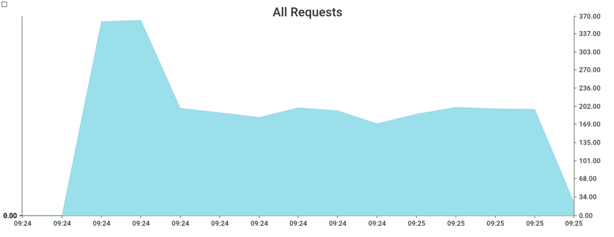
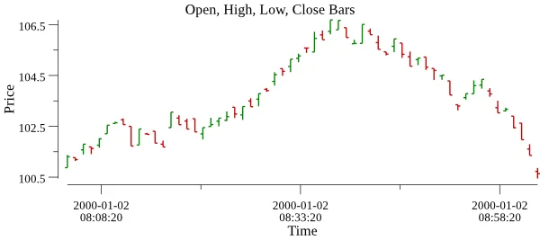
这里查询了10分钟的数据,生成的图片为
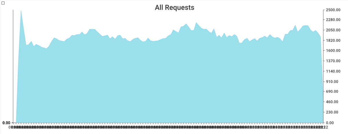
可以看到图表上的 x 轴已经看不清了,这是因为数据点非常多,而 go-chart 没有对此进行适配。
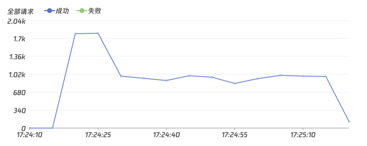
在数据点较少的情况下,比如只查询1分钟的数据,生成的图片为:
优点
- 图表的自定义程度高,例如可以选择给曲线填充颜色等
缺点
Time.timefloat64graph := chart.Chart{
Series: []chart.Series{
chart.ContinuousSeries{
XValues: []float64{1.0, 2.0, 3.0, 4.0},
YValues: []float64{1.0, 2.0, 3.0, 4.0},
},
},
}
buffer := bytes.NewBuffer([]byte{})
err := graph.Render(chart.PNG, buffer)
go-chartsgo-charts
Go-chartsgo-chartlinebarhorizontal barpieradarfunneltable官方效果图
lightgrafana安装
go get -u github.com/vicanso/go-charts/v2
实际使用
influxdbxValue := []string{}
yValue := [][]float64{}
// 处理结果
for _, value := range allRequest[0].Series[0].Values {
tempY := []float64{}
resultX := value[0].(string)
xValue = append(xValue, resultX)
number, _ := value[1].(json.Number)
resultY, _ := number.Float64()
tempY = append(tempY, resultY)
}
// 对 x 轴格式化 原:2022-07-29T09:24:10Z,新:09:24:10
formatXValue := []string{}
for _, x := range xValue {
formatTime, err := time.Parse(time.RFC3339, x)
if err != nil {
}
formatX := formatTime.Local().Format("15:04:05")
formatXValue = append(formatXValue, formatX)
}
f := false // 设置 x 轴的样式
// 字体文件需要自行下载
buff, err := ioutil.ReadFile("./TencentSans-W7.ttf")
if err != nil {
panic(err)
}
err = charts.InstallFont("noto", buff)
if err != nil {
panic(err)
}
// 渲染图表
p, err := charts.LineRender(
yValue,
charts.FontFamilyOptionFunc("noto"),
charts.TitleTextOptionFunc("全部请求"),
charts.XAxisDataOptionFunc(xValue),
func(opt *charts.ChartOption) {
opt.XAxis.BoundaryGap = &f
opt.Padding = charts.Box{Left: 20, Right: 50, Top: 20, Bottom: 20}
},
charts.ThemeOptionFunc("grafana"),
charts.WidthOptionFunc(1000),
)
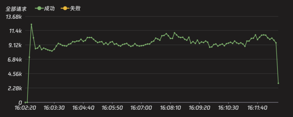
查询10分钟的数据,生成的效果图为:
light如果只查询1分钟的数据,效果图如下
go-charts优点
go-chartsstring[][]float64[]float64go-chart[]float64缺点
go-chartgo-charts作者的回复是他自己的使用场景只需要用到5条曲线左右,建议如果涉及到太多的曲线,最好分开画图。
不过都不是什么大问题,是一个很好用的开源库。
chart
前面这三个库的名字真是太像了,并且这三个库都提供基础图表的绘制功能。但是这个库更关注自动缩放、误差线和对数图等图表,并且对漂亮UI完全不在乎。
官方效果图
安装
go get -u github.com/vdobler/chart
详细说明
这个库支持的图表类型有
- 带状图
- 散点图/函数图
- 直方图
- 条形图和分类条形图
- 扇形图/环形图
- 箱形图
“Provide basic charts“以及在介绍里面,这个库有以下几个特点:
- 轴的值可以是线性、对数、分类或者时间/日期轴。
- 自动缩放具有很多选项。
- 抽动和标签的精细控制。
txtgsvggimggplot
plotcode.google.com/p/plotinum官方效果图
-
默认样式
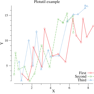
-
更细粒度的控制
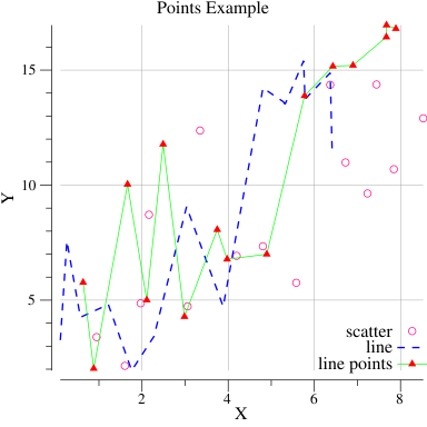
-
自定义刻度线
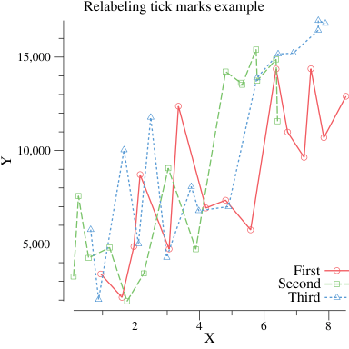
-
带误差的点
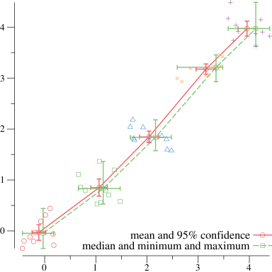
-
条形图
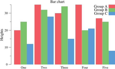
-
函数
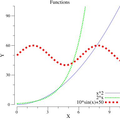
-
直方图
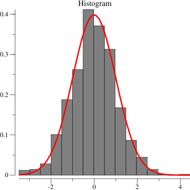
-
垂直箱形图
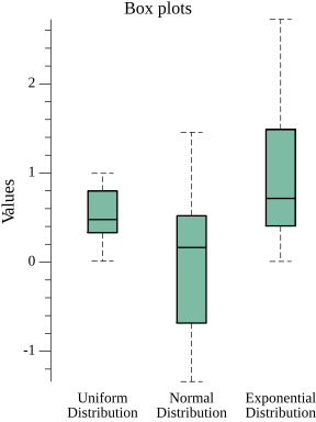
-
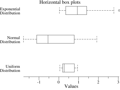
水平箱形图
-
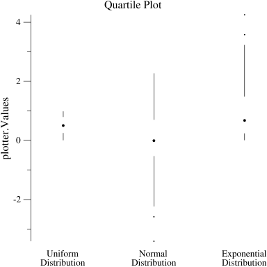
四分位图
-
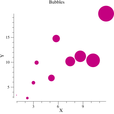
气泡图
安装
go get gonum.org/v1/plot/...
详细说明
plotplotplotterplotutilvgplotfloat64plotterCommunity Plotters · gonum/plot Wiki · GitHub
https://github.com/gonum/plot/wiki/Community-Plotters
一些社区绘图器的示例图:
plotters/piechart at master · benoitmasson/plotters · GitHub
https://github.com/benoitmasson/plotters/tree/master/piechart
2.
GitHub - pplcc/plotext: Extensions and custom plotters for the gonum plot packages
https://github.com/pplcc/plotext
go-echarts
go-echartspyecharts官方效果图
安装
go get -u github.com/go-echarts/go-echarts/v2
详细介绍
go-echartsApache ECharts
https://echarts.apache.org/zh/index.html
HTTPHTML总结
Gogo-chartgo-chartschartplotgo-echarts